Emojis - The Logos of Life
What’s your favourite emoji? Cheeky monkey? Glass of wine?
Mine changes daily, but the smiley turd seems to sit on my ‘most used’ emoji list constantly.
The growing influence of emojis on our daily lives is a joy to behold. Since I bought my new iPhone, I’ve become hooked on the little critters. According to research from eMarketer, 6 billion emojis are sent every day on smartphone devices across the world. Life will never be the same.
What is it that makes them so damn fun?!
As folk we need to empathise when we talk to each other. But raw words, when used on their own without face-to-face interaction, don’t enable us to fully express ourselves or understand the person behind the message.
Lets face it, ‘lol’ and ;-) just don’t cut it any more. If you’re still using these, hang your head in shame. Lol.
Emojis add emotion and fun to our electronic dialogue. As a graphic designer, it doesn’t surprise me that little pictures, accompanied by text, work well.
And here’s the rub. Logos – there’s loads of them. New ones, old ones, some as big as your high street. There’s a good reason why some of the most successful brands have a little picture as part of their logo (a.k.a. ‘icon’ or ’symbol’).
Like a face to a name, pictures make information more memorable. Nike’s swoosh, Starbucks mermaid, Apple’s apple.
Think of those pictures. While you’re thinking of them, you’re probably receiving ‘bonus’ information to your brain. Things like what that company - via the combined text and picture - means to you. Feelings, memories and emotions are being unpacked from that little visual parcel.
Et voila! The information finds its way into your brain much better than plain old text. The picture acts like the information’s passport to the long term recall part of your memory.
Have picture, can understand. Have picture, can remember.
Another advantage to pictures is that they don't need translating. The Apple symbol has instant meaning, no matter where you are in the world, or what language you speak.
The recent proliferation of emojis have reminded me just how important pictures are to communication. The fun logos of life in the ultra-digital age.
Given that we all love pictures so much, “Why the hell do so many businesses decide to have a logo without a picture?” I hear you cry. In the graphic design trade we call these symbol-free logos ‘wordmarks’. There are plenty of examples out there.
In my experience, some businesses feel that one iconic symbol just doesn’t represent their company accurately enough. Some believe that a wordmark on its own, designed in a really cool font, is strong enough.
Of course there is a bigger picture beyond the logo (e.g. colours, tone of voice, photography, etc) which all help to build a unique and memorable brand. Think of CocaCola and that scripty wordmark, the devotion to the colour red and that iconic bottle shape.
At Good we’ve had quite a few branding briefs where the elements beyond the logo are equally important, for example Scotch Whisky branding. Product branding and service branding are two very different beasts… a whole different subject best left for another day!
In this multicolour, multilingual and multicultural world, its safe to say that picture-less communication is a bit dull. Sure, its much more challenging to create an iconic symbol for a business than it is to pick an emoji for that text about your big night out. But its well worth the effort, believe me.
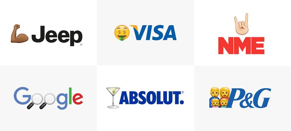
As a bit of fun, I’ve taken some wordmark logos and added an emoji.
See what I mean?
