More Good Branding
I recently wrote a post on the definition of good branding, where I used a young Filson store assistant in Portland as a great example of how good branding can positively influence behaviour in both staff and customers.
To an extent, this is the base level of what branding can be expected to achieve. But it can also be the tip of the iceberg with regard to the reach and influence of branding within any given organisation. It can and arguably should be the filter through which all business decisions can be filtered. From internal communications to employment criteria. Digital content to guidance for successful mergers and acquisitions. The list is frankly endless.
I recently came across a good example of this that ties to my previous article about Good branding.
Not only did we have a tremendous wee experience in our aforementioned Filson store, but we were also lucky enough to get a tour of Nike’s Global Headquarters in Beaverton, Oregon. As you’d expect, these guys know a bit about brand and branding. They know who they are, what they’re doing and where they’re going, and the brand is alive and well in every single touchpoint.
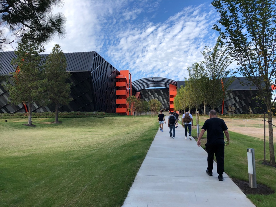
The campus is a symphony to Nike’s history and ambition. Buildings named after athletes old and new. Physical and graphic homages to exploits, records and achievements. Everywhere you look Nike apparel and shoes are worn by staff with gusto. Phil Knight’s sales van and the original sketches of the Nike ‘swoosh’ take pride of place. In every building, gyms, basketball courts, swimming pools and climbing walls encourage all to live the dream. Visiting college American football teams go through drills on training pitches. Banners and slogans to the good and great of Nike’s sponsored athletes are around every corner, on every walkway. I was delighted to see that 'Bo still doesn’t know Diddly!’
Cross-pollination of teams is encouraged in cafes and breakout spaces inside and out. Innovation is in the blood of the company and is prevalent everywhere and in everybody. And if all this gets a little too much, head to the Japanese garden - a living salute to Phil Knight’s original investors - to chill out, recharge and seek inspiration.
This isn’t a headquarters it’s a brand experience of the highest calibre, focused not on the consumer, but on the very people who bring ‘Just Do It’ to the max every day. Nike’s 14,000 staff who pour through its gates each morning to push the brand forward and establish an unassailable lead for others to follow.
If I’m honest, I kind of expected all of that. What I didn’t expect were the lengths to which these guys use their brand to influence and drive decisions where others simply wouldn’t bother. Let’s talk about one of Nike’s parking garages.
To begin with, architecture plays a big part on campus. Great design and innovation run through all the building’s DNA. Reference the latest pantheon to Seb Coe. The latest in a long line of stunning buildings by premier architects that hug the lake in the centre of the campus. I could count four more under construction.
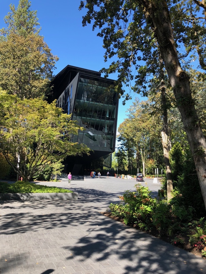
Anyway, done for the day, we were offered a lift to another location to catch our Uber back into Portland. Wandering through the immaculate gardens - tended by a dedicated Nike gardening team - we were led toward a stunning black and orange structure. Another edifice to an iconic athlete? Nope! This fantastic piece of architecture was a Car Park. Iconic, cool, original and innovative, I simply couldn’t wait to get to it.
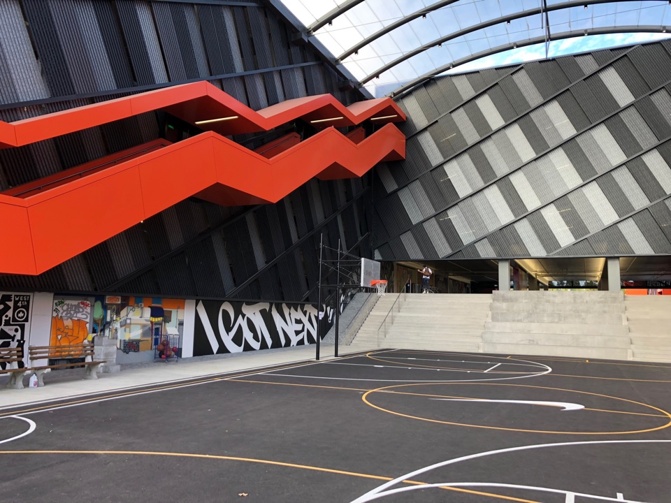
How many car parks do you know have a basketball court incorporated into its entranceway with concrete bleachers for those that just want to chill and watch. This isn’t going home for the night. This is an opportunity to show the employees how much the brand cares and to once again underline the ethos of the company. Meet friends before you shoot home. Get some exercise, swap ideas, push yourself just a little further. Interact. Grow. Enjoy.
Some monstrosities I’ve used for parking are generally well ‘tagged’ by local worthies, it’s often less than inspiring. Here the brand has used its roots and previous campaigns, employing a host of individual artists, to execute graffiti and murals to illustrate the company’s many amazing stories.
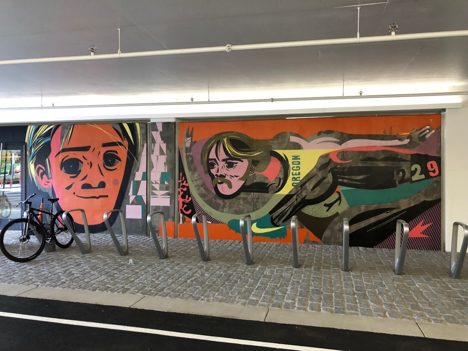
Great lighting. Charging Stations. Beautifully designed bike racks. Hopscotch if you fancy it and a game of giant chess for those that fancy exercising their cerebral cortex, as well as their muscles, before leaving for home.
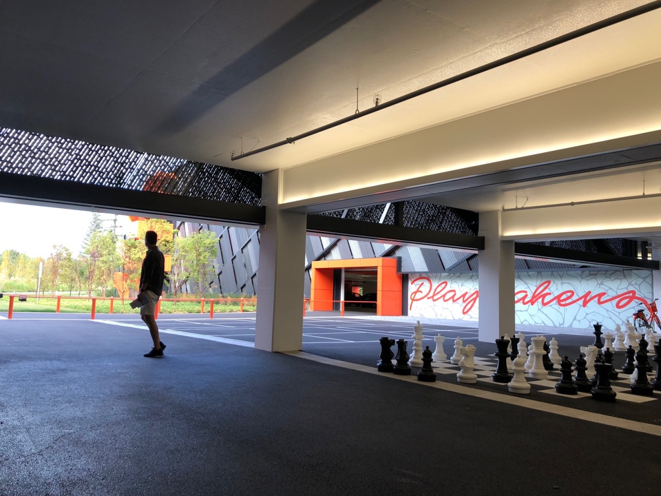
This could have been a garage. It’s not. Its an experience, because Nike takes branding very seriously indeed. Oh, and I believe their Director of Buildings and Construction is Scottish, which is also a good sign!
Of all the great things I experienced on the Nike campus, that garage is going to stick with me. If you’re going to ‘Just Do It’ in branding terms. Do it all. Do it right.
Have a look at the first part of my Good branding series. You'll find the third and final part on how Nike are the masters of the everywhere brand.